It’s springtime everywhere, and the drab monotone of the sullen winter fades and is replaced with the fresh, soft colors of the season.
Dig out your favorite, bright pastels and add a burst of sunshine to your spring paintings!
Colors of the seasons are historically influenced by nature and holidays associated with the time of year.
Today, seasonal colors are also influenced by marketing, and fashion designers play a big part in the colors that are hot in any given year.
If you’re a professional artist that produces work for home decorating, take a tip from fashion and home decorating designers in choosing a palette for an upcoming season’s production. Adding the tones that are promoted in the marketplace can give you a boost in sales when you can tie your paintings into the current trends in decorating colors.
Greens
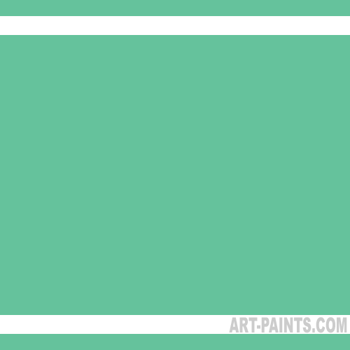
Green is traditionally a color of spring, and the soft greens of tender shoots peeping through the earth is a good place to start. Colors like Yellow Green, Sap Green and Permanent Green Light are perfect to portray the spring foliage of budding trees and blossoms.
Home fashion, on the other hand, is showing a lot of Emerald Green and a soft, muted Jade Green that blends well with the bright pastels of spring. Use these as accent colors or as a focal point to enhance a painting for this season’s show entries.
Blues
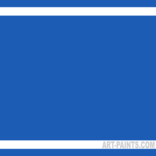
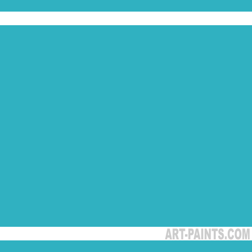
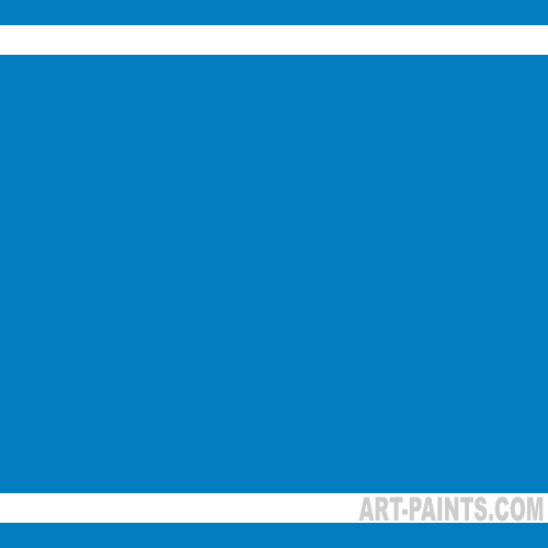
For those of us who see nothing but overcast, gray days all winter long, the sight of a Cerulean Blue sky puts us in mind of spring. Azure Blue and Cobalt Teal waters bring promise of sunny beaches and warm sand.
Cobalt Blue Hue and Blue Light are colors that the design industry are highlighting this season, and they’re colors that work well in almost any setting.
Reds
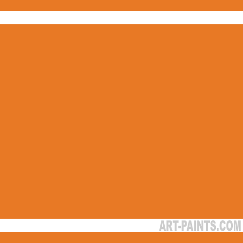
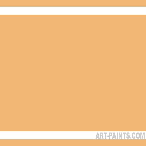
If your heart turns to floral paintings when spring rolls around, you’ll want to paint Pink Madder and Quinacridone Pink roses and cyclamen to brighten up your bouquet. Pebeo Salmon and Apricot are rich, soft hues that are perfect for spring tulips and dahlias.
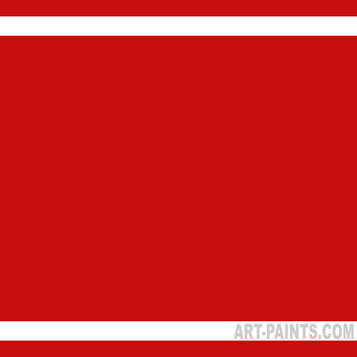
Jaune Brilliant is a color very similar to those warm coral shades seen in fashion and decorating, and Cadmium Red adds a poppy red glow to spice up a soft palette.
Yellows
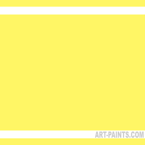
Yellow Lake’s softly muted shade mimics this season’s yellow entry to the design world, but nothing can beat the Cadmium Yellow Light, Cadmium Yellow Medium and Lemon Yellow Hansa to paint springtime floral arrangements and to paint hard-to-believe-they’re-real sunsets.
Lavenders
If violets, pansies and Technicolor sunsets are on your painting agenda, Light Violet, Interference Violet and Permanent Violet Dark will fill your palette with rich, luminous hues. These tones are used for local color as well as warm, rich shading and shadows.
Spring is fleeting and full of lush, rich color. Get out your plein air painting kit, galoshes and plan to spend the day stomping about in the great outdoors. Smell the fresh air and sketch your fresh impressions of springtime sites that move you. Let all your senses come into play as you begin a new season of painting exploration this spring.
