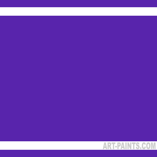
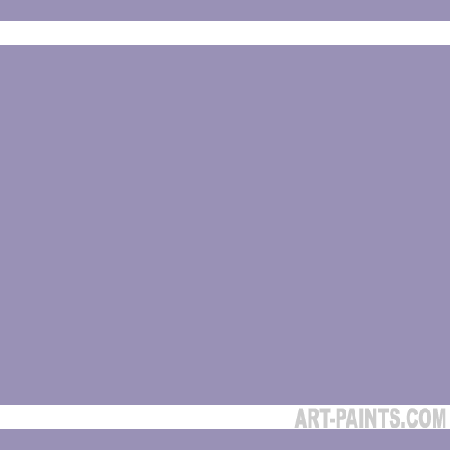
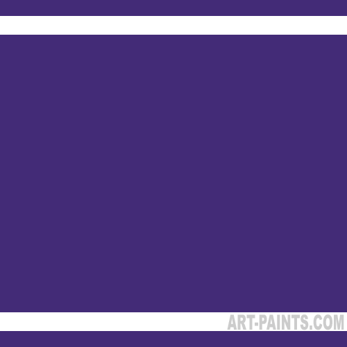
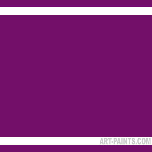
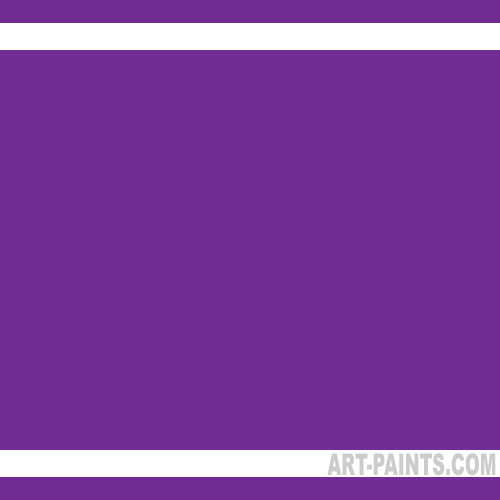
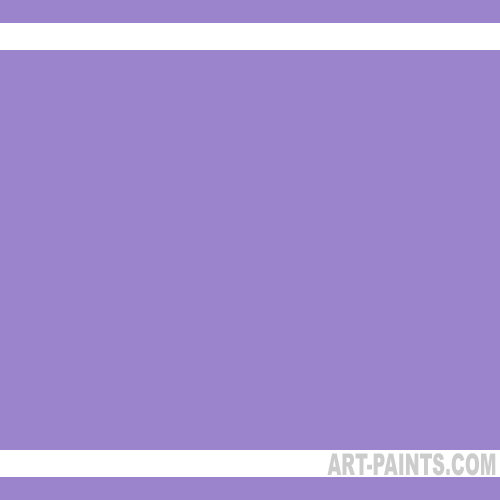
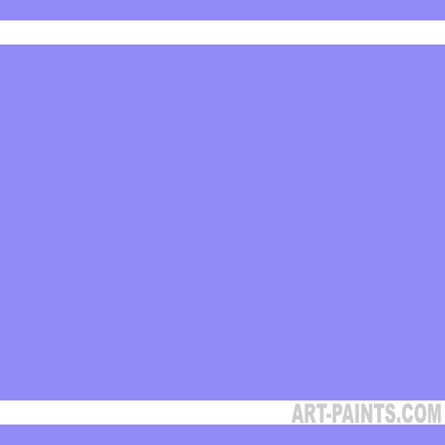
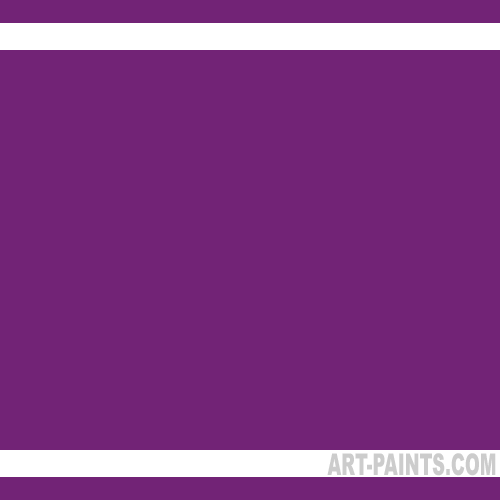
Purple conjures luxury and opulence for many folks.
It’s the color of royalty, wealth, spirituality and wisdom.
The pigment used to create purple was historically very expensive, so only the wealthy could afford to have clothes made using this costly dye.
Priests and other spiritual leaders also wore vestments dyed with purple, and artists seldom could afford to have purple in their palette of colors.
People have strong feelings about some colors, and purple brings an emotional response in many when asked how they feel about this extravagant color.
Some people love purple in all its shades and hues, while other folks are really turned off by the color. However, purple has so many permutations that there’s probably a hue to please almost everyone.
Shades Of Purple
There are so many versions of purple available in today’s market that it’s hard to sum up this shade with a few choice adjectives. On the color wheel, purple is the color between red and blue. There’s a lot of room for interpretation with that kind of general placement on the chroma chart. This color group ranges from the red end of the spectrum with violet hues and closes at the blue end of the wheel with deep indigo purples that almost appear black. We’re just going to call them all shades of purple and let other purple purists bicker among themselves.
Warm Purple Shades
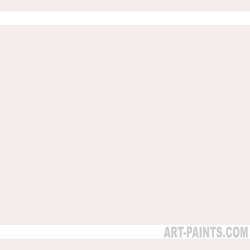
Purple starts on the warm side with a pastel, pink tinged hue like Mauve. This color is a combination of both Dioxazine Purple and Quinacridone Violet mixed with Titanium White. This opaque color is a pastel right out of the tube, so it can’t be used for deep contrasts.
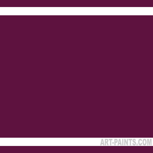
Permanent Madder Lake takes on a deeper tone while keeping its red roots, it is tinged with the deep, ebony-like Dioxazine Violet.
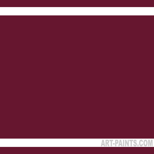
Permanent Red Violet takes the red-toned purple family about as dark as one can go. Quinacridone Magenta and Dioxazine Violet give this color depth and both pigments are transparent and have strong tinting characteristics.
Cool Purple Shades
Permanent Violet Opaque is a blending of Titanium White, Quinacridone Violet and Dioxazine Violet. This pale purple is opaque and is a cool, blue pastel.
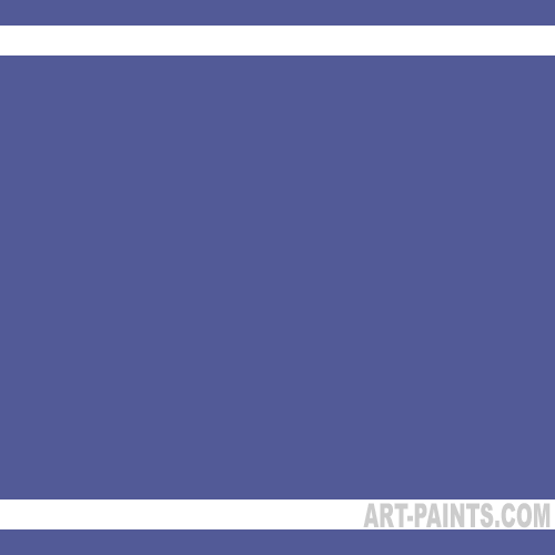
Medium Violet is a medium purple that is almost the poster child for the color purple. Made with Quinacridone Magenta, Dioxazine Violet and Titanium White, this purple is the quintessential color for regal garb.
Dioxazine Purple is a nearly black purple with a high tinting strength. It is also transparent, so it makes a good glaze. It is also used as a base hue from which other colors are derived.
The list of purple colors available in tubes, jars and cakes is very long. Every manufacturer has its own special formulations and in-house colors. They also all create their versions of the industry standard colors. Creating your own personal purple palette can be an adventure that also adds to the seemingly infinite number of lush and luxurious purple variations.
Here’s a partial list of some of the more popular purple picks available from various paint purveyors:
Cobalt Violet Hue
Light Violet
Permanent Blue Violet
Permanent Violet Dark
Quinacridone Deep Purple
Quinacridone Magenta
Quinacridone Maroon
Quinacridone Violet
Violet Oxide
Use purple in its darker shades as a substitute for black and deep shadow areas. Add some pastel purple to punch up a drab, lifeless area of your painting. Use bits of purple when painting with orange and yellow to bring drama to your artwork. By using complementary colors, you can create tension in your piece or make your focal point pop.
Purple is a very intense color that’s worth adding to your palette. Whether you’re mixing your own variations or buying tubes of ready-to-paint colors, try purple on your next painting. You may be impressed with how much that little bit of color can do.
