Colors are the basic building blocks of painting. Color is the visual representation of different wavelengths of light. History reports that in the early 18th century Isaac Newton developed the first color circle when studying the effect of prisms and light. Since that point in history, a number of scientists, scholars and artists have investigated color and developed a number of color charts, wheels, triangles and graphs.
The history of the color chart is filled with probably more scientists than artists. It has only been in the last couple of centuries that artists themselves have developed in-depth theories on color.
Here we are discussing color as it relates to artists’ paint. In our age of technology, color as it relates to computers, monitors and web pages should not be confused with the artistic color wheel of history.
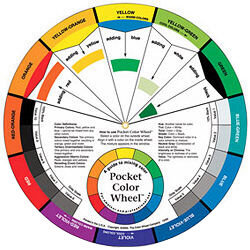
For the artist, color wheels are a graphic representation of the way color is created. It can be broken down into three groups: Primary, secondary and tertiary colors.
Primary Colors
All colors are derived from three basic colors: Red, Blue and Yellow. These are the building blocks of all other colors in their various forms. The first spokes of color wheels are comprised of these three.
Secondary Colors
Color wheels are next broken into a second set of colors created by combining adjacent primary colors. These colors are Orange, Purple and Green.
Tertiary Colors
The final set of colors included in the wheel is made from the combination of a primary color and the adjacent secondary color. The common name given to these colors is generally the two names of the colors used to blend this color: Yellow-Green, Yellow-Orange, Red-Purple, Red-Orange, Blue-Green and Blue-Purple.
Complementary Colors
Complementary colors are those colors directly opposite from each other on the color wheel. Knowing this relationship is important to the artist. Using complementary colors adjacent to each other gives the greatest contrast, or punch to a painting.
It may be termed as “jarring.” If an artist wishes to bring attention to an area of a painting, this is a sure-fire way to do it.
Analogous Colors
Analogous colors are those who appear adjacent or near each other on color wheels. They are similar and are useful for gradual transitions and quiet expression.
Using Color Wheels
A beginning artist needs to learn theory. One of the basics is how to create the colors they use on their painting.
It is not enough to buy a tube of every color on the shelf and start making brushstrokes. Seldom do artists use paint just as it arrives from the manufacturer. The artist must learn how colors react with each other to develop a painting with professional hues and gradations of color.
Using color wheels is helpful for artists at any level.
For the beginner it is a learning tool. For the advanced artist it is a quick check reference to verify or plan. Becoming proficient with how colors interact is a big part of moving from student level to professional artist.
Color Charts
It is one thing to use color wheels to learn about color relationships and another to work with the paints you have in your tabouret. A good educational exercise is to make color charts of the paints you own.
By doing this, you are learning the characteristics of each of your paints. Every paint has its own qualities and understanding those traits allows you to make painterly choices based on understanding rather than guess work.
There are a number of ways to make color charts, but they basically are a grid work on which you paint each square with a color or color combination to record the results. You can have color charts for different purposes.
Some portrait artists make up a color chart for skin tones. One may make a chart of complementary colors. They are useful reference or history of how your colors work with each other.
An artist may also make charts that show the gradation of color as more of a single substance is added to the basic color. The artist adds the color white as a lightening agent with acrylic, oil or gouache, or additional water when using watercolor paint. In these types of charts, the painter will see the gradual progression of the intensity of the color.
It is a useful reference to help in making value choices.
As an artist, one is continually learning. A student starts with the basics. Drawing and color theory are the two primary things one needs to become a capable artist.
An artist’s history of development should include expanding the skillful use of tools necessary to create works that speak to the viewer. An understanding of color and its history gives the artist an enhanced voice in telling his story. He can expand and push the limits when he has first learned the basic tenets of his craft.
